
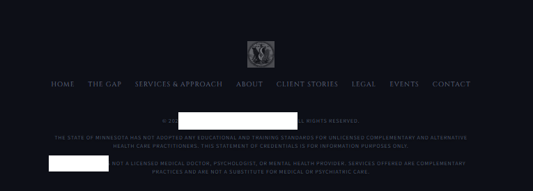
Contrast Ration
Low contrast ratio is one of the most common web accessibility failures, occurring when text doesn't stand out enough from its background color for people to read it comfortably. WCAG requires a contrast ratio of at least 4.5:1 for normal text and 3:1 for large text against its background, but many sites use light gray text on white, or pale colors on similarly pale backgrounds, that fall well short of this. This creates a real barrier for users with low vision, color blindness, or age-related vision decline, and even affects fully-sighted users in bright sunlight or on low-quality screens — making it both a legal compliance risk under ADA/WCAG and a usability problem that can drive visitors away.